Evolution of a dream interface
22 Aug 2022
For many years now, i’ve been thinking about what it would look like if i were to design a desktop of my own. So i decided to do some drawings, taking into account the things that i think are important.
The genesis
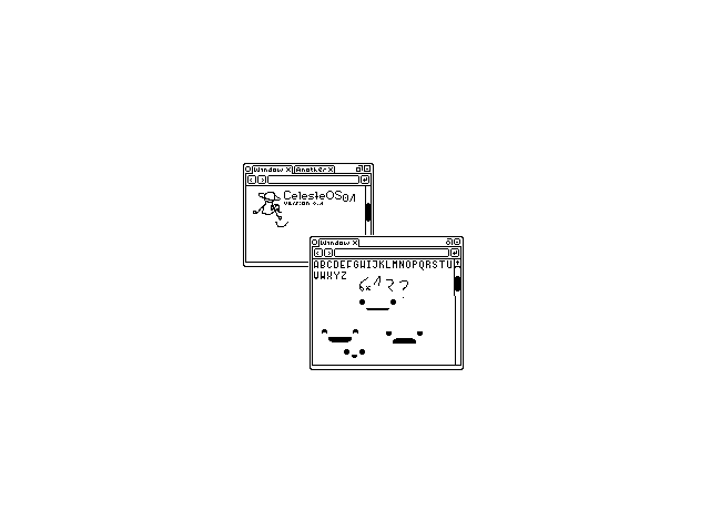
This was the first mockup i drew, calling the project “celeste” because i think it’s kind of poetic. This one is very crude, but even so, some of the important elements are clear here.
A quite distinctive feature is the tabs being a part of the window manager. I came to value this a lot when i was heavily using chrome os; because most things are web pages, i found it frustrating when using linux applications, the os settings, and so on, as i could not interact with them in the same way as i could with the rest of the system.
The browser design inspiration is quite obvious here. That empty bar between the navigation arrows and go button on every window is its url bar.
An interface with depth
Having decided on some of the fundamentals, i made some big changes, and for quite a while made only incremental changes to this design.
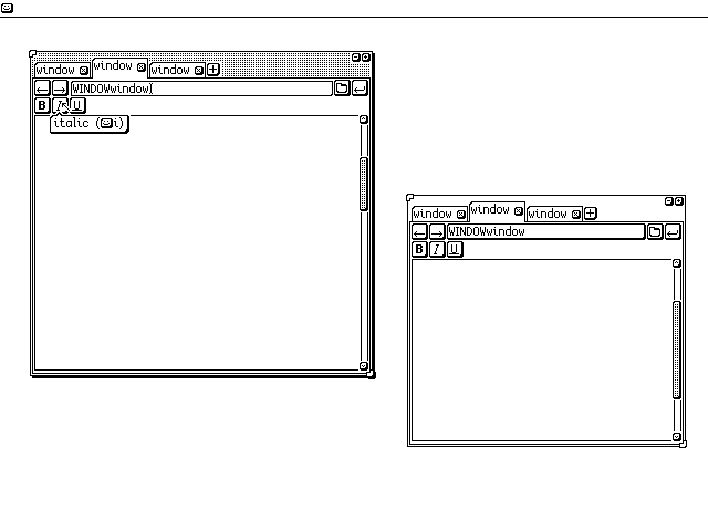
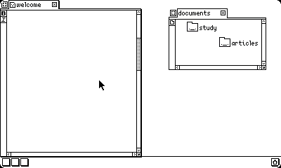
First of all, there’s now a top bar. There’s barely anything in it, but the happy button on the left is supposed to open a new empty window (equivalent to C-n in a browser).
It’s much more obvious which is the active window now or it would be if there were more than two windows; it’s the one on the left. There are a lot of drop shadows in the ui, which i like. At this point, i was assuming a screen size of about eight or nine inches, so i made most things a bit bigger so that usage would be more comfortable.
The active tab is raised above the others to make it clear which it is. Each window has two resize nubs, at the top left and bottom right corner. This allows windows to be easily resized in any direction.
On the right side of the url bar there is a directory selector. This would probably open the file browser in the current tab (the file browser would simply be another url). I wanted to avoid a modal file browser, as that would make switching tabs whilst browsing files messier.
The scrollable part of the scrollbars are stippled now; the solid black in the previous design was too bright for me. Andthe close buttons for each tab look more like buttons now; making buttons look like buttons was important to me as i don’t like the trend of making everything flat and uniform when it should be interactive.
Some minor cleanups
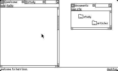
I moved the global toolbar to the left. The reason for this is so that if a window is full screen, we can easily move to the tabs because they will be on the top edge, and easily hit the toolbar, because it is on the left. We only have to aim along one axis. That said, it currently still doesn’t have much use.
The active tab is no longer a different height, because it looked messy and altered the size of the grabbable area. I experimented with different visual distinctions, such as a heavier top border, removing the rounded corner, and as here putting the rounded corner on the opposite side.
Also, the inactive scrollbar is no longer stippled, with the intent to make it look less active. That was probably unnecessary, as it’s not like the active window is subtle.
Buttons everywhere!
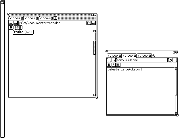
Here the icon for the active window has been replaced with a button over the title. I wanted this idea to work, either icons or titles, but i wasn’t sure about either. It was suggested to me that i leave a default title and don’t let the user change it until it is iconified, which would work nicely with the rest of the ui but make the user have to think of a title as they minimise for fear of forgetting what the window held after they had iconified and wanted to get on with something else. For this reason, i didn’t continue that thread.
A big change is that the toolbar is populated! Global commands, such as copy, paste, and global help, are located here. Copy and cut are greyed out because the user hasn’t selected anything for them to operate on. The help button is left just below the copy/cut/paste buttons in the global toolbar. It would make more sense for it to be at the other end, like it is in the windows, so it doesn’t move if other icons are added. Then again, the idea is that icons aren’t added. In which case, that bar is mostly dead space. shrug
The directory view in the window on the right can be toggled by the two left-most buttons below the url bar. There is a searchable list view, inspired by emacs’s tabulated-list-mode, and a spatial file view, not shown.
The window on the right is showing the settings directory. The “bun” format is short for bundle and each is a directory or file that can be run as a program. The idea is that there is nothing particularly special about the settings ui. All settings should be stored in settings.db, a database that any program can request access to keys and values from, so there should be no need to have to input eg. email server details for every email program. Obviously, this could be abused (see: macos, android, dotfiles for a few examples) but that’s the idea at least.
Windows now have titles, and an icon. The icon is a button that when clicked lets the user edit it. This icon would be shown in the window outline if it is iconified (see top right). I think i got the idea for iconifying windows like this from fvwm; regardless, i like it more than a taskbar.
The stipples for the active window don’t encroach on the tabs. I tried multiple things here, including horizontal lines (like early classic mac os), vertical lines, diagonal lines… every kind of lines to make it look less busy. This wasn’t a concrete decision.
I also added tab icons here, and went back to every tab having the same curved corner.
A major cleanup
At this point, i decided that the design was getting overly busy, and started almost over again. I made the screen resolution lower, mostly so i would have to draw less, and simplified a lot of the design:
The tabs are now sticking out of the window, as they do on haiku.
Much of the 3d design has been removed. A lot of this was also to make implementing fitts’ law more intuitive. When there are shadows between a scrollbar and the screen edge, it looks like you cannot be touching the screen edge to use the scroll bar, for example. I want to make sure that every button still looks like a button though; they should all have borders.
There is no longer a url bar. I wanted to explore the spatial ui paradigm, and i think that a url bar is too confusing to use in conjunction with this. The back and forward buttons are removed because without a url bar they make less sense. I need to further explore how to integrate tabs into the spatial paradigm.
There is no longer a new tab button. This is also due to the spatial paradigm. The new tab button would open a particular file or launcher page, i hadn’t decided which yet. But i would rather the target is created and then opened via the file system. Once again, this is a tentative concept.
Further applications of fitts’ law are that the toolbar for each window is on the left, so that i can ram the pointer to the left to find the action i want, and that the global toolbar is on the bottom, because its previous placement on the left would conflict with the window toolbars.
The scroll bars are always shown. I don’t like ui items appearing and disappearing. Part of this is because of the realignment jump that happens if the content becomes bigger than the viewport and the scrollbar appears. Part of this is so that the user doesn’t get in the bad habit of selecting text by ramming the pointer to the edge of the screen. Note that this is not a bad habit in itself, but i consider it an issue if it sometimes works and sometimes doesn’t.
I’ve removed the searchable list view of files, instead having just a spatial icon view.
There is a single button in the top left of each window to iconify it and move it. I’m not sure how i feel about this yet, as it’s not particularly discoverable design.
The resize nubs have been replaced with a single resize square. This makes the window look less cluttered, and works better with the redesigned scrollbars, at the expense of some convenience; now you cannot resize a window in any direction, but only to the right and bottom side. The window must be moved from the top left to manipulate those positions. This is somewhat consistent with how other operating systems are most commonly used.
The far right of the global toolbar has a house button which represents showing the desktop. I wanted to change this icon as it does not make much sense in this metaphor to me.
I have added little curves to the corners of the screen, purely because i think rounded screens are cool.
The maximise window button is gone. Windows can now only be maximised by dragging them to the top (or left or right for a half tile) of the screen. Perhaps i will change this. One thing i know is that i am not keen on the idea of a special maximised state. That is, how many window managers will remove extra window chrome when in full screen. The window should always look the same, just differently sized.
Currently there is a 1px bar of whitespace below the tab bar but above the window content. I like this, because it makes it clear that the tab is attached to that window. However i also think it looks a little strange. I will experiment with other ways to keep the functionality while improving the look.
Moving towards consistency
For this next iteration, there are two buttons in the tab bar. The one on the left is to move the window around, and the one on the right is to iconify the window. Though they look embedded within the window, clicks to the edge of the bar will activate them. Whether the user picks up in this deserves further exploration. I brought back a full length titlebar, which is almost exclusively aesthetic, because it looks better with the buttons in the corners.
The toolbar is moved across the top, rather than down the side. Although i prefer for it to be on the side so as to make the click targets larger, i wanted to make it text and those two desires weren’t compatible. This is part of my move to remove tooltips from the interface. All clickable text is underlined, like a url.
The tabs no longer have drop shadows. It is clear enough which is active from the open bottom, which is more obvious now that the toolbar is horizontal.
The bottom left displays contextual help. I haven’t worked out how this will get cleared, or if any of it should have user interaction. It is inspired by emacs’s echo area, in particular the functionality that a graphical emacs has when display-tooltips is set to nil—that is, tooltip information is displayed here. This is a better solution than tooltips, because more information can be shown, and because each button is text, the tooltip can offer further explanation (such as “make the selected text bold”) rather than acting as a key for an obscure icon.
Note that “new file” is a single button, despite having a space; because i want these buttons to be as transparent as possible, i want the user to be able to edit this bar. I’m not sure how this will work to distinguish “new file” from two buttons, “new” and “file”, except to hope that developers don’t name anything as ambiguously as “new”. But that is not a good thing to hope for. If this sounds familiar, i took the idea from acme.
The drop shadows on windows have gone. I intend for the system to be focus-follows-mouse, which is impossible to show in a screenshot. But i realised that this meant that i didn’t need drop shadows, as the mouse makes that clear, and drop shadows provide unattractive flickering when moving across windows.
What about tiling?
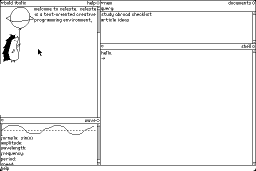
Here, i’m experimenting with a tiled window paradigm. I think there are some significant benefits to it, especially if you move away from the necessity of being entirely keyboard controlled. This was heavily inspired by project oberon and plan 9’s acme.
Now onto the interface. We have a bottom bar, which will be populated with global commands (currently it just has help). Commands are no longer underlined, which i’m not a fan of. I wanted to see if it was an aesthetic improvement, and if that was worth more than the functionality of an underline.
The display is split into columns, which can be split into windows. The titlebar has the window name/type on the right, and relevant commands on the left. I’m not sure exactly what to call the window name, because i don’t necessarily want it to be unique. At the moment it describes the type of window.
The titlebar has two icons; the inverted triangle allows you to “collapse” a window so that only the titlebar is shown, to save space. The circle allows you to close a window. There isn’t a way to move windows around, which needs to be rectified. When a window is collapsed, the triangle will point to the right.
The top left window is a text view, which can also hold images. The bottom left window is a wave view. The idea is that another window will be able to make use of this content, which is exposed as a wave with the parameters defined (excuse my terrible drawing of a wave). This window is also predominantly text, which can be edited. The parameters can be modified in real time which will change what the visualisation looks like.
Note that period and speed are defined using the above variables; period = 1/frequency, speed = wavelength/period = wavelength*frequency. Changing one of the first variables will change the period or speed respectively. If you change period or speed, the others should update too, in whatever way makes the most sense. That is, changing the period should change the frequency, and changing the speed should change one of period, wavelength, and frequency. In the latter case, i’m uncertain which would be the most expected behaviour.
There should be a way to manipulate the numbers shown without having to type them. For example, by dragging on them. I haven’t worked out exactly how that will work yet.
The window on the top right is the document view. It has a query field in the title bar, where the user can have real time search. Files are stored as hashes, the name is just metadata. There is no hierarchy, but potentially tags will be used to provide further organisation.
The bottom right window is a shell. I also need to expand my ideas for a learnable command line, and change the name from “shell” to something else. This is the default type of window, which appears when a new window is created. It will act similarly to a familiar shell, albeit more like a plan 9 shell, with no vt100 graphical hacks.
Putting it all together
I didn’t keep the tiled concept for very long. After thinking about what i wanted, i realised i’d been sort of neglecting fun. And floating windows are simply more fun. Also, the way i want a workflow to go, floating windows might actually work better than a tiling grid. I’m happy with this for the moment, we’ll see what happens.
Obviously the revert to floating windows is a big change, but there is a lot more that’s changed too.
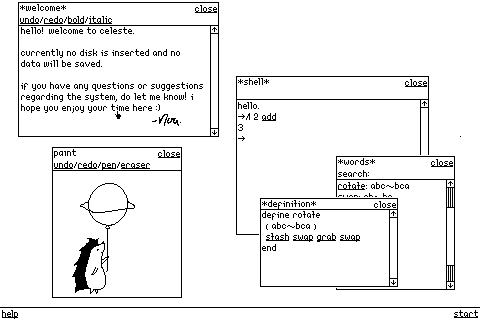
The windows don’t have curves in the corners. Sad, but i like the clean square look for now. Curved corners are cosmetic more than functional.
The close button in the title bar is now a word. This is orthogonal with every other function being a word (except the scroll buttons; i could’t make that look good). The only option in the toolbar is currently close. I’m thinking about adding help, or minimise of some description.
Notably there are no tabs, unlike every other iteration with floating windows. Again, we’ll see about this because they were kind of one of the things which even made me start thinking about this.
There are slashes to separate commands in the tool bar. I think this is more legible, but i’m not certain on this. I’ve also brought back the underlines on function words.
I’ve made the scrollbars slightly wider. I did this before changing the close button, and actually what made me think oh that should be text was that the different widths looked kind of ugly. I kept them wider anyway. I also changed the dots on them to vertical lines, so that the scrubber was symmetrical whatever size the bar (i didn’t like the look of the dots touching the bottom line, or having an extra gap).
Command words in the shell are underlined. Clicking on them opens the definition inspector.
The inspection tools are new, i’ve put them on to partly highlight my thinking about the underlying system. Obviously the idea is that it’s a virtual machine of some description, and smalltalk is a big inspiration. But i’m not so taken with the objecty nature of smalltalk, so i’m thinking about ways to make forth more introspective. This is the most obvious realisation of that, making word definitions viewable. The words screen is akin to smalltalk’s class browser. I’ve put “docstrings” next to word names, which are just comments in the definition. The language is a forth-like, and inspired by forth, but doesn’t follow all of forth’s conventions. Specifically here, defining words with colons has been replaced with words, because i like words more than symbols. There’s more to figure out here.
Windows have a white border around the black outside border, because i thought it looked cleaner.
I’ve changed the mouse from the classic pointer arrow to a little pointing finger! The shape has been shamelessly stolen from the left editor for uxn.
Conclusion
This was a really fun thing to work on! I’m still not happy with the final result, but the more i worked, the more i was thinking not only about the look, but also how the system should work. One of the reasons that i think people have such fond feelings towards amiga os and classic mac os is because the look of the system is very closely tied to the functionality of the system. It’s hard to replicate that on something like linux.
I want to do some more work on this in the future, but for now i’m going to put the mockups to rest.